Shoes & Bags, Hardware & Software, and K-Pop Design
On doing things differently, the lasting power of the Birkin, and design's cultural impact on the music industry

Letter from the Editor
Patterns 001
A few weeks ago, I was looking at screenshots of early iPhone app interfaces. What struck me wasn't how dated they looked—it was realizing how many of their revolutionary interface patterns we've since abandoned. Skeuomorphic design, once heralded as the future of digital interfaces, now feels as distant as Art Nouveau. And the same has happened for every interface development since.
This rapid evolution teaches us something crucial about design: to create what hasn't been created before, we must be willing to break from how things have "always been done." The familiar path might feel safe, but it rarely leads to breakthrough moments. Best practices, while valuable, are really just best practices for their time—and time moves quickly.
In this issue, we'll see this principle at work: K-pop reimagining album packaging beyond recognition, "internet of things" being reconceived from the ground up, and even something as timeless as a handbag marking cultural turning points. Each example shows what's possible when we question established patterns.
As designers, we often say there are no sacred cows. But perhaps more accurately, there are no permanent solutions—only responses to moments in time. Our job isn't just to create, but to read these moments and respond with courage and intention, knowing that true innovation often means leaving the comfortable path behind.
This newsletter is my attempt to make sense of these moments with you. Together, we'll explore how design shapes—and is shaped by—the forces of culture, technology, and commerce. Not to find universal answers, but to ask better questions and challenge what we think we know.
The Design Lens
T Magazine: The 25 Shoes and Bags That Transformed Fashion
Considering the list is supposed to be "the accessories from the past 100 years that changed how we carry our things — and ourselves,” I’m not sure I agree with the whole list (note that the order is arbitrary).
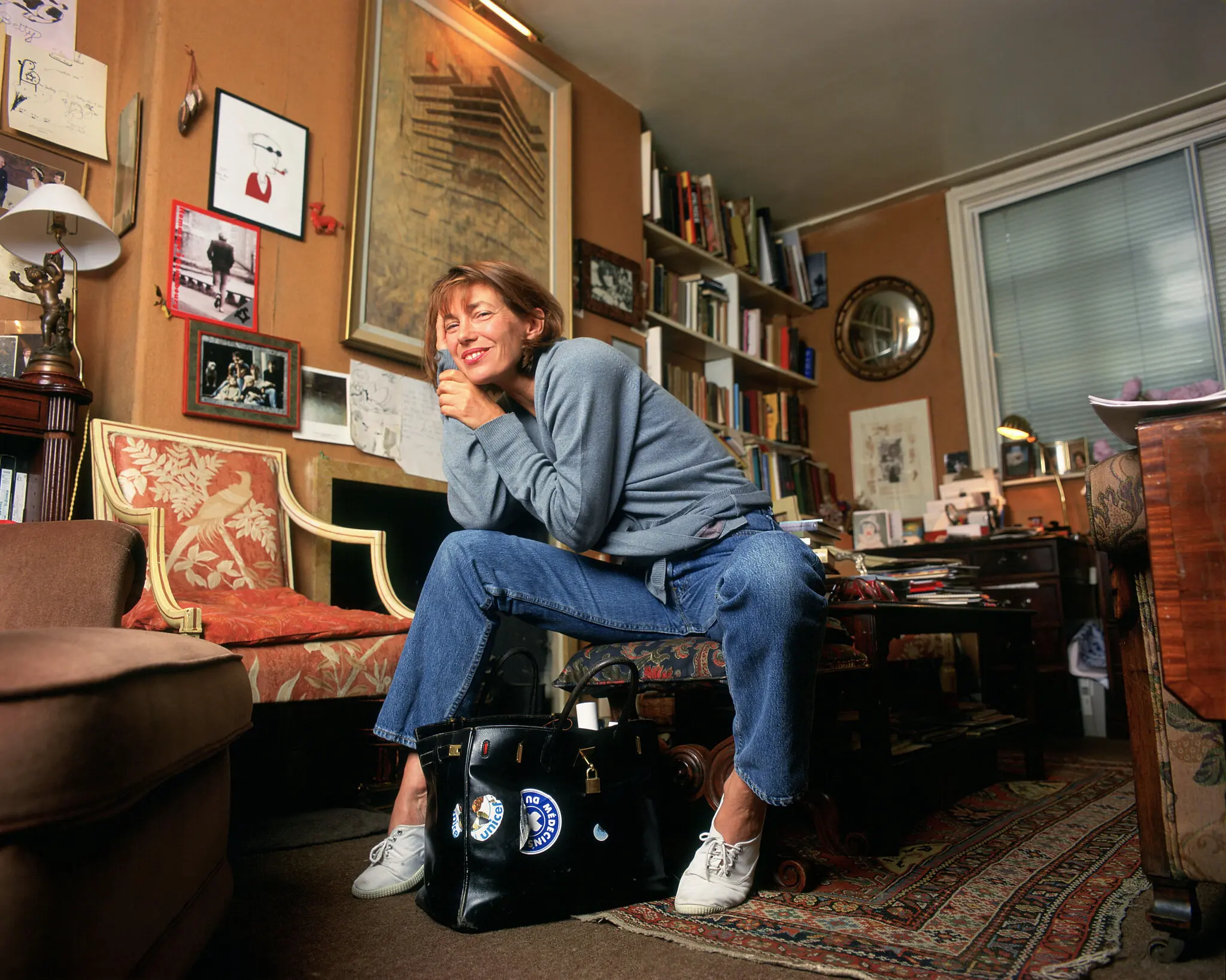
That said, it’s an ambitious one and I admire the diversity of choices and the honest attempt to span the last century. My favorite ones from it are the undeniable ones: the Hermès Birkin Bag (1984), the Timberland Yellow Boot (1973), the Nike Air Jordan 1 (1985), Christian Louboutin’s Daffodile Heel (2011), and the newest, the Telfar Shopping Bag (2014). Their T Mag's summary of the Birkin:
Introduced by Hermès in 1984, the Birkin might be the world’s most in-demand handbag, with an origin story that’s fashion legend. Earlier that year Jean-Louis Dumas, the French luxury house’s executive chairman, was seated next to the actress and singer Jane Birkin on a flight from Paris to London and witnessed her straw basket bag tumble to the floor, its contents scattering everywhere. Birkin complained about how hard it was to find a good, practical weekend bag; the two began exchanging ideas, and her namesake was born. Its briefcase-like design looks simple enough, but it can take Hermès artisans from 15 to 20 hours to hand-stitch each one.
While fashion designers navigate cultural tensions around luxury and access, technology designers face their own paradox: how to make connected objects that don't feel like technology at all. Future Facility's approach offers an intriguing solution...
Monocle: Connected Thinking with Future Facility
An outgrowth of design studio Industrial Facility, known for furniture, product, and exhibition design, Future Facility was founded in 2016 by co-founders and designers Sam Hecht and Kim Colin to design connected products for the internet of things, and now led by creative director Leo Leitner.
Future Facility gives physical, digital and experiential form to ideas. We research, invent, prototype, curate, synthesise, communicate, provoke and creatively direct – to help clients evaluate potential in future products and services. We believe in making things in order to evaluate them. Our strategic design activities cross over UI, UX, engineering and product.

The term “IoT” (which stands for the "Internet of Things") has not really entered mass-market the way we thought it would back in 2016 when the assumption was that the refrigerators, washing machines, and ovens in our households were going to be connected to the internet. But it did get something right. While not everything ended being connected to the internet (nor did it need to), there’s definitely a significant integration of hardware and software happening right now beyond the smartphone, and I agree with the founders’ premise, as they relayed to Monocle: “We want to question what technology brings to an object,” says Leitner. “We need to imagine the potential for products in terms of how we actually live with things. Then we can find out how the technological possibilities can be integrated.” says Colin.
Since, they’ve come out with the Poster Card, a multi-color e-paper display where friends can send photos to that’s not stored in any network.
They also designed a security camera for Geneva HQ as part of a system of battery-powered, fully wireless, and easy-to-manage home sensors and devices.

Another is the Herman Miller Powerbox, a portable, shared, high-capacity battery that can charge up to 4 devices, part of an entire ecosystem that can come with a Powetray that can hold and charge 4 boxes, and an (optional) app that can manage and support the whole system.

I really like the premise of Future Facility and often wonder why there’s not enough studios that attempt to integrate hardware and software. While it’s definitely not easy feat (it would require combined skills in research, industrial design, electrical engineering, and UI/UX design), increasingly, it feels like where the future is headed—if not already here—especially with the anticipated and inevitable proliferation of AI. This kind of practice and the products they produce (think of Teenage Engineering partnering with Nothing, or an Apple design team for hire) is certainly welcome.
This idea of turning constraints into features isn't limited to product design. K-pop's entire design ecosystem shows how apparent limitations—like physical albums in a digital age—can become opportunities for innovation...
ItsNiceThat: A look inside the K-pop design machine

ItsNiceThat published a really good in-depth report from their Seoul correspondent James Chae on K-Pop graphic design. There’s a ton of culture-shifting and mind-bending design coming from South Korea right now popularized by the now globally-dominant K-Pop machine. From Chae:
Lately, I’ve spotted the most impressive lettering and graphic design work on the albums and products of K-pop groups. A K-pop band produces a diverse set of products, ranging from album packaging to photo books, collectible photo cards and tour merchandise. […] Additionally, I suspect that with the growing interest in vinyl, concert and merchandise sales becoming a larger portion of artist revenue and a new generation obsessed with media nostalgia, there is a boom of music design happening and K-pop agencies are clearly paying attention to the details.
Some examples he gives are Bryan Hyunh’s fantastical photography for Aespa, Phillip Kim of Smile Flower Studio grotesque typography for Seventeen, Park Shinwoo of Paper Press’ yearbook design for NewJeans, MHTL’s identity for K-pop festival K-Con, and Kim Dohyun of Studio Bbareunson’s promotional website for Idol Key.


The designs from each of the design studios are otherworldly, and it’s really great to see a collection that’s pushing the envelope of graphic design and a glimpse into the conversation and immersion design is having with pop culture and vice versa.


The interesting part about this is design has been a clear pivotal part in how K-pop artists connect with their fans. Physical CDs are still a prevalent part on this side of the music industry, and opening albums has been akin to unboxing a luxury product. Music is no longer the object being sold; each piece of memorabilia is a collectible that fans would genuinely want to share. With each music video becoming a visual extravaganza, the world-building art direction bleeds into the graphics, identities, and merchandise, and every piece of item whether physical or digital, feels like it's meticulously created to add on to the brand and expand the artists' personal connection with the fans.
Music has always been an artistic canvas for design, from Peter Saville's work on Joy Division and New Order, to Cey Adams' art direction for Jay-Z, DMX, and the Beastie Boys, and Stanley Donwood's Radiohead album covers. One can say this is an evolution of that era, with the world-building being taken to new heights now that it's expanded to every social platform and not just the album sleeve or promotional posters, and with designers having more latitude to extend design systems to interactive websites, billboard sized LED screens, concert stage layouts, and retail spaces.
With more mediums, touchpoints, and possibilities, design's cultural impact on music has never been more prevalent.